
Data visualization in Python has revolutionized how data professionals and businesses transform raw information into actionable insights. Interactive dashboards represent the pinnacle of this evolution, enabling real-time exploration and dynamic storytelling with data.
The human brain processes visual information 60,000 times faster than text, making data visualization dashboards one of the most effective tools for data-driven decision-making. Furthermore, interactive dashboards provide enhanced flexibility and customization compared to static alternatives, leading to better insights and faster business responses.
However, what makes Python’s approach truly powerful is its combination of simplicity and sophistication. Whether you’re an Algerian data scientist looking to showcase machine learning models or a business analyst presenting quarterly reports, data visualization in Python offers the perfect balance of technical capability and user-friendly implementation.
This comprehensive guide will transform you into a dashboard creation expert, covering everything from basic Plotly charts to production-ready Dash applications. By the end, you’ll understand why interactive dashboards with Plotly/Dash have become the gold standard for modern data presentation.
What is data visualization in Python and why does it matter?
Data visualization in Python refers to the using Python libraries and frameworks. The field has evolved dramatically in 2025, with AI integration, real-time analytics, and low-code capabilities becoming standard features.
Python’s dominance in data visualization stems from several key advantages. The language offers extensive libraries including Plotly, Dash, Matplotlib, and Bokeh for creating interactive and high-quality visualizations. Additionally, its seamless data integration capabilities allow connections with databases, APIs, CSV files, and JSON formats for real-time data processing.
The interactive nature sets Python apart from traditional visualization tools. Unlike static charts from Matplotlib or Seaborn, Plotly generates interactive plots that allow users to zoom, pan, and hover for detailed insights. This interactivity proves incredibly valuable for exploratory data analysis and presentations that require a deeper examination.
But why should Algerian professionals care about this technology? The global demand for data visualization skills continues to grow, with industry professionals believing that the choice of visualization package significantly impacts decision-making. For professionals in Algeria’s expanding tech sector, mastering these tools opens doors to international opportunities and local market leadership.
Explore more : Use Data Visualization to Tell Powerful Data Stories That Drive Action – Around Data Science
The power of Plotly: Interactive visualization at its best
Plotly stands out as the interactive dashboard king among Python visualization libraries. This Montreal-based company’s library supports multiple programming languages including Python, R, MATLAB, and JavaScript, making it accessible to diverse technical audiences.
Key features of Plotly
Modern Plotly offers several compelling advantages over traditional visualization libraries. The library provides over 40 chart types including line charts, scatter plots, bar charts, pie charts, 3D plots, statistical graphs, and SVG maps. Its interactive features support hover effects, zooming, panning, and data series toggling capabilities.
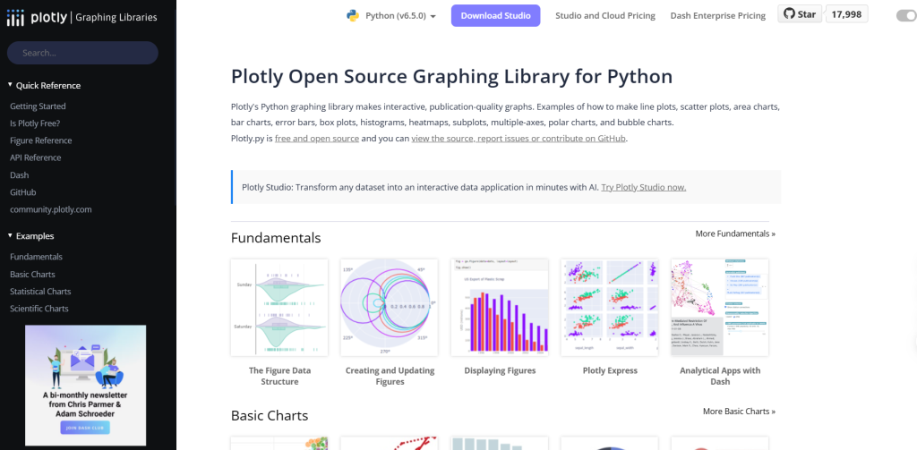
Furthermore, Plotly‘s integration capabilities extend beyond basic charting. The library connects seamlessly with Dash for building analytical web applications, and it can generate HTML code for website embedding. This versatility makes it perfect for both standalone analysis and web-based dashboard deployment.
Plotly Express vs Graph Objects
The library offers two main APIs for different use cases.
Plotly Express provides a high-level interface for rapid visualization creation, similar to Seaborn’s approach but with interactive capabilities.
Meanwhile, Graph Objects offers granular control over every aspect of visualization, similar to Matplotlib’s detailed customization options.
The choice between these approaches depends on your specific needs. For quick exploratory analysis and standard chart types, Plotly Express delivers impressive results with minimal code. However, when building complex, customized dashboards, Graph Objects provides the flexibility required for professional applications.
Understanding Dash: The framework for interactive web applications
Dash represents a paradigm shift in dashboard development, allowing data scientists to create sophisticated web applications using pure Python. This open-source framework combines Flask as the web server, Plotly.js for interactive graphics, and React.js for dynamic user interfaces.
Why Dash dominates dashboard development
Dash’s supremacy over alternatives like Streamlit, FastAPI, Flask, and Django stems from several factors. The framework’s simplicity allows developers to build web applications using only Python, eliminating the need for HTML, CSS, or JavaScript knowledge. This empowers data scientists and analysts to create visually appealing dashboards without requiring separate front-end developers.
Additionally, Dash boasts an extensive library of interactive components built upon React, ensuring high performance and seamless user experience. These components include graphs, tables, sliders, dropdowns, and buttons that are easily configurable and customizable.
Dash architecture and components
A typical Dash application consists of three main elements: the layout, components, and callbacks. The layout defines the visual structure using HTML and Dash components. Components include input elements (dropdowns, sliders, buttons) and output elements (graphs, tables, text). Callbacks create interactivity by connecting user inputs to application responses.
This architecture enables developers to build everything from simple single-page dashboards to complex multi-page applications with database connections and real-time updates.
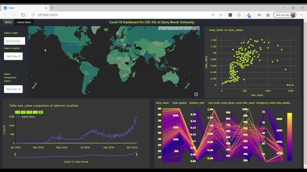
Creating your first interactive dashboard
Let’s build a practical dashboard to demonstrate the power of Plotly and Dash. This example showcases essential concepts while remaining accessible to beginners.
Setting up your environment
Before creating dashboards, ensure you have the necessary libraries installed:
pip install dash plotly pandas
Basic dashboard structure
Here’s a fundamental Dash application structure:
from dash import Dash, html, dcc, callback, Output, Input
import plotly.express as px
import pandas as pd

# Initialize the app
app = Dash(__name__)

# Create sample data
df = pd.DataFrame({
    'City': ['Algiers', 'Oran', 'Constantine', 'Annaba'],
    'Population': [3500000, 1500000, 450000, 350000],
    'GDP': [45, 25, 8, 6]
})

# App layout
app.layout = html.Div([
    html.H1('Algeria Cities Dashboard'),
    dcc.Dropdown(
        id='metric-dropdown',
        options=[
            {'label': 'Population', 'value': 'Population'},
            {'label': 'GDP (Billion USD)', 'value': 'GDP'}
        ],
        value='Population'
    ),
    dcc.Graph(id='city-graph')
])

# Callback for interactivity
@callback(
    Output('city-graph', 'figure'),
    Input('metric-dropdown', 'value')
)
def update_graph(selected_metric):
    fig = px.bar(df, x='City', y=selected_metric,
                 title=f'Algeria Cities by {selected_metric}')
    return fig

if __name__ == '__main__':
    app.run(debug=True)
This example demonstrates core Dash concepts: component layout, dropdown interaction, and callback-driven updates.
Advanced chart types
Plotly supports numerous chart types perfect for different data scenarios.
- Line charts excel at showing trends over time, making them ideal for tracking business metrics or scientific measurements.
- Scatter plots reveal relationships between variables and help identify correlations or outliers.
- Pie charts effectively represent proportional data.
- Bubble charts add a third dimension to scatter plots through bubble size.
- For statistical analysis, box plots visualize data distribution, showing median, quartiles, and potential outliers.
- Meanwhile, heatmaps excel at displaying correlation matrices or intensity data across two dimensions.
Mastering Callbacks
Callbacks represent the core mechanism that transforms static visualizations into dynamic, interactive applications. Understanding callback structure and implementation is crucial for building sophisticated dashboards.
Callback structure and syntax
Every Dash callback consists of three essential components. The @callback decorator defines the relationship between input and output components.
Output objects specify which components will be updated and which properties will change.
Input objects determine which components trigger the callback and which properties are monitored.
Here’s the basic callback syntax:
@callback(
    Output('output-component-id', 'component-property'),
    Input('input-component-id', 'component-property')
)
def callback_function(input_value):
    # Process input and return output
    return processed_output
Multiple inputs and outputs
Advanced dashboards often require callbacks with multiple inputs and outputs. This capability enables complex interactions where multiple user inputs influence several dashboard components simultaneously.
@callback(
    [Output('graph1', 'figure'), Output('graph2', 'figure')],
    [Input('dropdown1', 'value'), Input('slider1', 'value')]
)
def update_multiple_outputs(dropdown_value, slider_value):
    # Create first graph
    fig1 = create_graph1(dropdown_value, slider_value)
    # Create second graph
    fig2 = create_graph2(dropdown_value, slider_value)
    return fig1, fig2
This pattern proves particularly useful when building comprehensive dashboards where user selections should update multiple visualizations consistently.
Real-world Callback applications
Professional dashboards leverage callbacks for various interactive scenarios.
- Filter cascading allows one dropdown selection to populate options in subsequent dropdowns.
- Cross-filtering enables selections in one chart to filter data in other charts automatically.
- Real-time updates can refresh dashboard data at specified intervals or trigger updates based on external events.
Learn more : Understanding the Interquartile Range (IQR) for Better Data Analysis – Around Data Science
Dashboard design best practices

Creating effective dashboards requires more than technical proficiency; it demands understanding of user experience and visual design principles.
Layout and visual hierarchy
Successful dashboard design follows established principles.
- Keep layouts simple and focused to avoid overwhelming users with too much information simultaneously.
- Use appropriate chart types for your specific data – bar charts for comparisons, line charts for trends, pie charts for proportions.
- Maintain consistent color schemes throughout the dashboard to create visual coherence.
Grid layouts provide structure and organization for complex dashboards. Dash supports flexible layout options using HTML Div components and CSS styling, enabling responsive designs that work across different screen sizes.
User experience considerations
Effective dashboards prioritize user needs over technical capabilities. Put yourself in the audience’s shoes when designing interfaces – consider what information they need and how they’ll interact with the dashboard. Clear visual hierarchy guides users through the dashboard logically, highlighting the most important information first.
Loading performance becomes critical for user adoption. Optimize dashboard performance by implementing data caching, reducing image sizes, and using progressive rendering for large datasets.
Deployment and sharing options
Creating impressive dashboards means little if they can’t be shared effectively. Fortunately, Dash applications offer multiple deployment options suitable for different scenarios.
Local development and testing
During development, Dash applications run locally using the built-in Flask development server. This approach enables rapid iteration and testing before production deployment. The debug=True parameter provides helpful error messages and automatic reloading during development.
Cloud deployment platforms
Several platforms facilitate Dash application deployment. PythonAnywhere offers free hosting for basic applications, making it ideal for personal projects or demonstrations. Heroku provides more robust hosting with scalability options for professional applications. Render offers modern deployment workflows with GitHub integration.
For enterprise applications, Dash Enterprise provides the most comprehensive solution with security features, scalability, and collaboration tools. This platform supports AI-powered development, one-click deployment, and enterprise-grade authentication.
Best Practices for production deployment
Production deployment requires additional considerations beyond basic functionality.
- Environment configuration ensures applications work consistently across development and production environments.
- Security measures including authentication and authorization protect sensitive data.
- Performance optimization through caching and efficient data handling maintains responsiveness under load.
5 Bonus tips for data visualization in Python
After years of dashboard development experience, these advanced techniques separate professional applications from amateur projects:
1. Implement smart data caching
Efficient data handling dramatically improves dashboard performance. Implement caching mechanisms to store frequently accessed data and reduce database queries. Use libraries like Redis or simple in-memory caching for development environments.
2. Design mobile-responsive layouts
Modern dashboards must function across devices. Utilize CSS Grid and Flexbox within Dash layouts to create responsive designs. Test dashboards on various screen sizes to ensure consistent user experience.
3. Leverage Plotly’s advanced features
Beyond basic charts, Plotly supports 3D visualizations, animated plots, and geographic maps. These advanced features can transform ordinary dashboards into compelling data stories that engage users and reveal deeper insights.
4. Integrate real-time data sources
Connect dashboards to live data streams using websockets or API endpoints. Real-time capabilities make dashboards more valuable for monitoring applications, financial tracking, and operational dashboards.
5. Implement user authentication
Professional dashboards require user management and access control. Integrate authentication systems to protect sensitive data and provide personalized dashboard experiences for different user roles.
Conclusion for data visualization in Python
Interactive dashboards with Plotly/Dash represent the future of data presentation, combining Python’s analytical power with modern web technologies to create compelling user experiences. Throughout this comprehensive guide, we’ve explored:
- The fundamental advantages of Python for data visualization, including extensive library ecosystems and seamless data integration capabilities
- Plotly’s superior interactive features that surpass traditional static visualization libraries through zoom, pan, and hover functionality
- Dash’s revolutionary approach to dashboard development, enabling pure Python web application creation without frontend expertise
- Practical implementation techniques from basic layouts to advanced callback systems for building professional-grade applications
- Industry best practices for design, performance optimization, and production deployment strategies
The democratization of dashboard development through these tools empowers Algerian data professionals to compete globally while serving local market needs. As AI integration and real-time analytics continue evolving, mastering data visualization in Python positions you at the forefront of this technological revolution.
Start your journey to become a data-savvy professional in Algeria.
👉 Subscribe to our newsletter, follow Around Data Science on LinkedIn, and join the discussion on Discord.


0 Comments