
For data scientists, data visualization is an essential skill for discovering key insights from complex datasets and communicating those findings effectively. But creating impactful data stories requires going beyond basic graphs and charts.
By applying data visualization best practices, you can design compelling narratives that inform decisions, influence stakeholders, and drive change.
In this post, let’s explore how to leverage data visualization to tell powerful and memorable stories with data that motivate your audiences to take action.
Let’s Go
The Power of Data Visualization
Data visualization is the process of representing data graphically to help people understand its significance. It allows us to transform raw numbers and statistics into meaningful insights, making it easier for decision-makers, analysts, and the general public to grasp complex concepts.

Here are some key reasons why data visualization is essential:
Simplicity: Visualizations simplify complex data sets, making them accessible to a wider audience, including those without a strong background in statistics or data analysis.
Clarity: Visualizations can clarify trends, patterns, and outliers in data, enabling better decision-making and problem-solving.
Engagement: People are naturally drawn to visuals, making data visualizations more engaging and memorable than raw data or lengthy reports.
Storytelling: Visuals can tell a compelling story, helping to convey the “what,” “why,” and “how” of your data, which is crucial for building a narrative.
Key Principles of Data Visualization
To create effective data visualizations that tell compelling stories, consider the following principles:
1.Optimize Data Viz for Your Audience
Who is your target audience and what do you want them to understand from the data? These key questions should guide your data visualization design process.
Consider executives who need high-level insights versus technical experts hungry for statistical details. Public audiences may require more explanatory setup before diving into the data.
Search audience needs, background knowledge, preferred medium (reports, presentations, dashboards, etc.), and goals in planning data visualizations. Keep it simple and highlight the most impactful insights.
2.Choose Optimal Chart Types
The specific chart or graph you select plays a huge role in clarifying or obscuring the story your data tells. Bar charts, scatter plots, area graphs, box plots, matrices, maps…which to use?
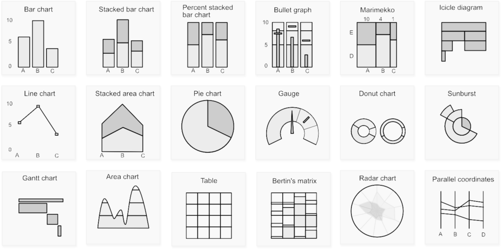
Different data visualization types have strengths and weaknesses for displaying certain kinds of data. Line graphs demonstrate trends over time clearly. Bar charts allow easy comparison across categories. Scatter plots reveal correlations. Pie charts show part-to-whole relationships.
Choose chart types strategically based on the relationships and insights you want to highlight from your data analysis. Avoid flashy visuals that don’t serve your narrative.
3.Direct with Narrative Flow
Order, explanation, transitions, and styling should guide your audience through your data stories.
Use headers, text, and annotations to call attention to key insights and moments. Transition seamlessly between visualizations to build your narrative.
Strategic use of color, layout, positioning, and graphical elements can further emphasize patterns, draw focus, and eliminate distractions.
Finally, apply storytelling best practices to turn data into a compelling and memorable narrative.
4.Increase Engagement with Interactivity
Interactive data viz allows audiences to engage more deeply with data stories.
Features like hovers, tooltips, clicking to filter or zoom, and animated transitions invite active data analysis.
Balancing interactivity with simplicity keeps your data narratives intuitive and accessible. Use it judiciously to increase insight discovery.
5.Balance Form and Function
Well-designed data visuals are more memorable and engaging, but avoid style over substance.
Use color, typography, whitespace strategically to increase clarity and recall, but focus on crafting a compelling narrative first and foremost.
By applying these principles, you can create data visualizations that inform, engage, and inspire. Data effectively visualized transforms numbers into memorable stories and compelling insights your audience will connect with.
Tools for Data Visualization
There are various tools available to help you create stunning data visualizations, including:
Tableau: A popular choice for creating interactive and shareable visualizations.
Power BI: Microsoft’s tool for creating interactive reports and dashboards.
D3.js: A JavaScript library for creating custom data visualizations on the web.
Matplotlib and Seaborn: Python libraries for creating static and interactive visualizations.
Excel: A versatile tool for creating basic charts and graphs.

Conclusion
Data visualization is a powerful means of conveying insights, trends, and stories hidden within data. By following the principles outlined in this article and utilizing the right tools, you can create compelling data visualizations that captivate your audience and facilitate better decision-making. Remember, the art of all that is not just about presenting data; it’s about telling a powerful story with data, making it a valuable skill in today’s data-centric world. Start crafting your data stories today! What story will your data tell next?
Welcome to a world where data reigns supreme, and together, we’ll unravel its intricate paths.


