
Building dashboards with Python is now essential for Algerian companies seeking faster decision-making and real-time visibility. Whether you’re in telecom, finance, retail, logistics, or energy, teams increasingly need interactive data tools, not static reports. Plotly, Dash, and Streamlit give engineers and analysts the power to build modern dashboards without expensive BI tools.
Let’s explore how to use them to turn DZ business data into actionable intelligence.
TL;DR
- Plotly, Dash, and Streamlit form one of the most powerful Python stacks for dashboarding.
- Plotly handles interactivity, Dash builds enterprise-grade apps, Streamlit provides rapid prototypes.
- This guide covers how each tool works, how to build dashboards, real DZ business examples, and production tips.
- Includes code samples, comparisons, and optimization techniques.
What is dashboarding with Python and why does it matter for DZ businesses?
Python dashboarding refers to building data visualization interfaces, analytic tools, and web-based dashboards using Python rather than traditional BI platforms like Power BI or Tableau.
Why it matters in Algeria
Algerian companies increasingly face:
- rising data volumes
- complex performance tracking
- pressure for digital transformation
- the need for low-cost, customizable BI tooling
Python dashboards solve these challenges by offering:
- cost-free, full customization
- easy integration with internal databases
- automation of business reporting
- deployable apps accessible across teams
With Plotly, Dash, and Streamlit, you can build dashboards matching the level of commercial BI tools, but without licensing costs.
What are Plotly, Dash, and Streamlit?
Plotly
Plotly is an interactive visualization library for Python. It generates web-ready charts with zooming, filtering, tooltips, and animations.
It supports:
- bar/line/scatter charts
- geospatial maps
- 3D charts
- heatmaps
- statistical plots
- business KPIs
- highly interactive UIs
Dash
Dash is a framework for building full web applications using Python only.
It uses:
- Flask (backend)
- React (frontend)
- Plotly.js (visualizations)
Dash is ideal for:
- multi-page dashboards
- enterprise reporting apps
- advanced UI logic
- authentication and roles
- scalable deployments
Read more : Data Visualization in Python : Dashboards with Plotly/Dash – Around Data Science
Streamlit
Streamlit is the fastest way to build dashboards with minimal code.
Its strengths:
- extremely simple syntax
- ideal for internal dashboards
- rapid prototyping
- data science workflows
- startup-ready tools
Streamlit apps feel modern, lightweight, and easy to extend.
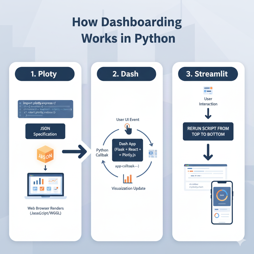
How dashboarding works in Python
How Plotly works under the hood
Plotly transforms Python objects into JSON specifications that a browser renders using JavaScript.
This separation makes charts fast, interactive, and responsive.
How Dash processes interactions
Dash uses callbacks.
User → UI event → Python callback → Visualization update.
All written in Python, no frontend coding required.
How Streamlit handles execution
Streamlit reruns the script from top to bottom whenever the user interacts with a widget, creating an extremely intuitive workflow for developers.
How to build dashboards with Python (step-by-step)
Step 1 — Install the tools
pip install plotly dash streamlit pandas numpy
Step 2 — Create your first Plotly chart
import plotly.express as px
import pandas as pd

df = pd.DataFrame({
    "Month": ["Jan","Feb","Mar","Apr"],
    "Sales": [120000, 150000, 170000, 165000]
})

fig = px.line(df, x="Month", y="Sales", title="Monthly Sales in Algeria (DZD)")
fig.show()
Step 3 — Build a Streamlit dashboard
# streamlit_app.py
import streamlit as st
import pandas as pd
import plotly.express as px

st.title("DZ Sales Dashboard")

df = pd.read_csv("sales.csv")

fig = px.bar(df, x="product", y="revenue", color="product")
st.plotly_chart(fig, use_container_width=True)
Run:
streamlit run streamlit_app.pyStep 4 — Build a Dash dashboard
# app.py
from dash import Dash, dcc, html
import plotly.express as px
import pandas as pd

df = pd.read_csv("sales.csv")

fig = px.line(df, "date", "revenue")

app = Dash(__name__)

app.layout = html.Div([
    html.H2("Algerian Sales Dashboard"),
    dcc.Graph(figure=fig)
])

if __name__ == "__main__":
    app.run(debug=True)
Plotly vs Dash vs Streamlit for Algerian businesses
| Feature | Plotly | Dash | Streamlit |
|---|---|---|---|
| Purpose | Visualization | Full web apps | Rapid dashboards |
| Complexity | Low | High | Very low |
| Enterprise-ready | ✔ | ✔✔✔ | ✔ |
| Multi-page | — | ✔✔✔ | Limited |
| Authentication | External | Native/enterprise | External |
| Best for | Charts | Production apps | Internal tools |
Discover : Create Your First Prediction Model: House Prices Project for Beginners – Around Data Science
Real use cases in DZ companies

Retail & e-commerce
- revenue dashboards
- demand forecasting
- inventory management
Telecom & ISP
- customer churn analytics
- network performance monitoring
- regional traffic dashboards
Banking & finance
- fraud detection dashboards
- credit scoring interfaces
- KPI monitoring
Energy, oil, gas & manufacturing
- production line analytics
- predictive maintenance
- real-time operational dashboards
🔥 For DZ e-commerce teams, Ayor.ai provides AI-powered automation, analytics, and product optimization tools that integrate well with dashboard workflows.

👉 Ayor.ai
10 bonus tips for building dashboards with Python
1. Pre-aggregate large datasets
Never load raw millions of rows into the dashboard.
2. Use caching (Streamlit & Dash)
Helps avoid repeating expensive computations.
3. Optimize Plotly rendering
Reduce traces, simplify shapes, use WebGL when available.
4. Keep layouts clean
Users prefer clarity over complexity.
5. Add drill-down interactions
Allows deeper inspection of data.
6. Use lightweight CSS (Dash)
Improves performance and UX.
7. Separate computation from UI
Use dedicated files or modules.
8. Test dashboards on mobile
Many managers in Algeria check KPIs on smartphones.
9. Paginate tables
Avoid lagging browsers.
10. Deploy smartly
Options:
- Docker
- on-premise servers
- DigitalOcean or Azure
- company intranet
Conclusion for building dashboards with Python
Python provides a powerful, flexible, and cost-effective ecosystem for dashboard development. Plotly offers world-class visualizations, Streamlit enables rapid iteration, and Dash is perfect for enterprise-grade solutions.
For Algerian engineers, these tools unlock modern BI capabilities without expensive tools or licensing fees.
Summary:
- Use Plotly for visual interactivity.
- Streamlit for fast prototypes and internal tools.
- Dash for scalable, production-ready dashboards.
- Keep UX simple and optimize performance.
Small gift : Python for Data Science: 5 Free Certification Courses You Can’t Miss
👉 Join the Around Data Science community (Discord), subscribe to our newsletter, and follow us on LinkedIn.
FAQs
1. What is the best Python framework for dashboards?
Streamlit for speed, Dash for enterprise apps, Plotly for visualizations.
2. Can Streamlit be used in production?
Yes, especially for internal dashboards and SME projects.
3. Is Dash harder than Streamlit?
Yes, but Dash supports more advanced UI and multi-page apps.
4. Can Python dashboards connect to SQL databases?
Yes, MySQL, PostgreSQL, SQL Server, Oracle, and cloud databases.
5. What are the best chart types for business dashboards?
Bar, line, KPIs, heatmaps, maps, and scatter charts.
6. Can I deploy dashboards locally in Algeria?
Absolutely, local servers, Docker, and cloud hosting all work.
7. Are Plotly dashboards fully interactive?
Yes, Plotly provides highly interactive, browser-ready visualizations.
Key takeaways
- Python is the leading choice for dashboards in Algeria.
- Plotly, Dash, and Streamlit each serve different purposes.
- Dash handles enterprise-scale apps.
- Streamlit accelerates development.
- Plotly provides modern, interactive charts.


0 Comments