
As data scientists, we constantly seek ways to understand and summarize the valuable information hidden within datasets. While the mean and standard deviation are popular choices, outliers can sway them. This is where the interquartile range (IQR) steps in. It focuses solely on the middle 50% of your data, making it one of the most reliable and interpretable measures of spread in statistics and data science.
What is the Interquartile Range (IQR) ?
Imagine splitting your dataset into four equal parts, called quartiles:
- Q1 → the 25th percentile
- Q2 → the median (50th percentile)
- Q3 → the 75th percentile
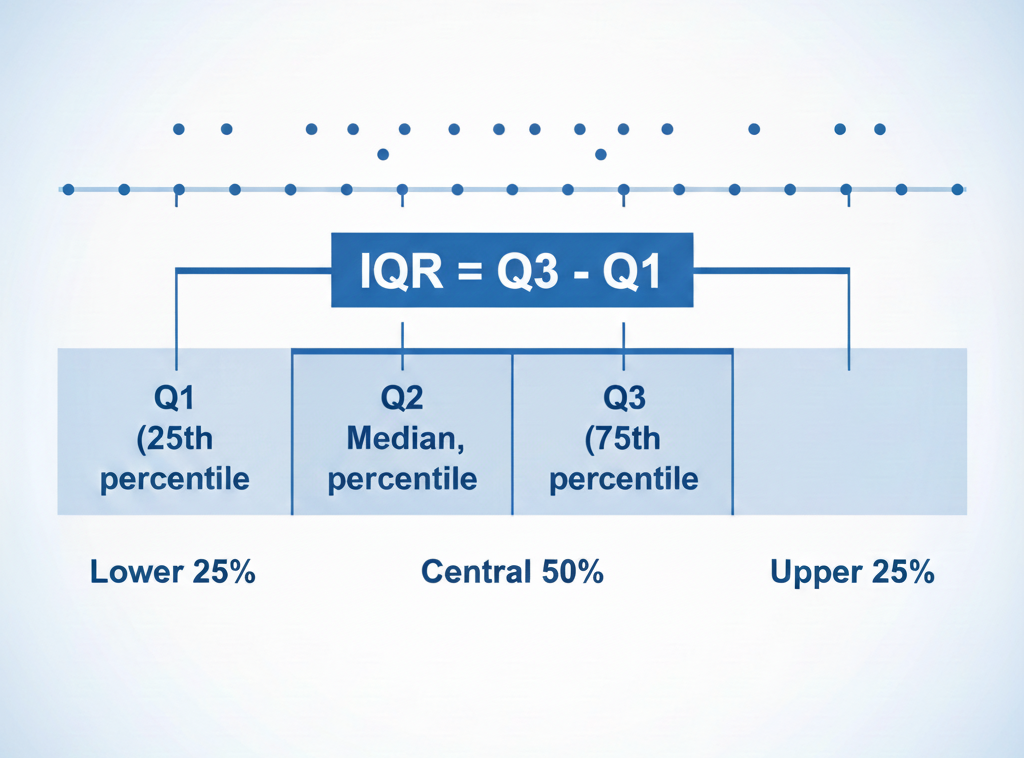
The IQR=Q3−Q1, representing the spread of the central half of your data.
Interpretation
- Large IQR → your central values are widely spread
- Small IQR → your dataset is tightly clustered
Formula:
IQR=Q3−Q1
Why choose the IQR over other spread measures – Standard deviation or range ?
The IQR is a go-to tool for its robustness and versatility, it is widely preferred in exploratory data analysis because it is:
✔ Resistant to Outliers: Unlike the full range, which extreme values heavily influence, the IQR zooms in on the core data.
✔ Ideal for Skewed Distributions: Works well when the data is not normally distributed, complementing the median as a measure of central tendency.
✔ Intuitive Comparison: Easy to compare variability between datasets.
IQR vs Standard deviation vs Range
| Measure | Sensitive to Outliers | Best Use Case |
|---|---|---|
| Range | Very high | Quick approximation |
| Standard Deviation | High | Normal distributions |
| IQR | Low | Skewed or noisy data |
📘 Step-by-step: How to calculate the IQR manually
Here’s how to calculate the IQR manually:
- Order the data: Arrange values from smallest to largest.
- Find the median (Q2): Divide the dataset into two halves at the middle value(s).
- Identify Q1 and Q3: Locate the medians of the lower and upper halves of the data.
- Compute the IQR: Subtract Q1 from Q3.
🔎 Worked example
Dataset:
1, 4, 8, 11, 13, 17, 19, 19, 20, 23, 24, 24, 25, 28, 29, 31, 32
Steps:
- Q2 (Median) = (20 + 23) / 2 = 21.5
- Q1 = 13
- Q3 = 25
- IQR = 25 – 13 = 12
➡️ The middle 50% of the data spans a spread of 12 units.
Detecting outliers
The IQR is the basis of one of the most reliable outlier detection methods:
$$ Lower Bound=Q1−1.5×IQR $$
$$ Upper Bound=Q3+1.5×IQR $$
Any value outside this range is considered a potential outlier.
This method is used in boxplots, anomaly detection, and robust preprocessing.
The IQR in boxplots (Explained clearly)
A boxplot visually summarizes key statistical properties:
- The box = IQR (Q1 → Q3)
- The line inside the box = median
- The whiskers extend up to 1.5 × IQR
- Points beyond whiskers are outliers
Read more : Prediction Metrics in Machine Learning and Time Series Forecasting – Around Data Science
How to interpret a boxplot

- Wide box → large IQR → high variability
- Narrow box → small IQR → low variability
- Long upper whisker → positive skew
- Outlier points → unusual observations worth investigating
🐍 Finding IQR in Python (NumPy + Pandas)
Using NumPy
import numpy as np

data = np.array([1, 4, 8, 11, 13, 17, 19, 19, 20, 23, 24, 24, 25, 28, 29, 31, 32])

Q1 = np.percentile(data, 25)
Q3 = np.percentile(data, 75)
IQR = Q3 - Q1

print("IQR:", IQR)
Using Pandas
import pandas as pd

df = pd.DataFrame({"values": data})

Q1 = df.values.quantile(0.25)
Q3 = df.values.quantile(0.75)
IQR = Q3 - Q1

print("IQR:", IQR)
Finding the IQR with Tools
Most statistical tools simplify the IQR calculation. For example:
- Excel: Use
=QUARTILE.EXC(data, 1)for Q1 and=QUARTILE.EXC(data, 3)for Q3. - Python: Libraries like
numpyandpandasoffer straightforward methods to calculate quartiles and IQR.
By analyzing boxplots, you can gain valuable insights into the data’s spread, central tendency, and potential presence of outliers. For instance, a wider box in a boxplot signifies a larger IQR, indicating a more dispersed dataset. Conversely, a narrower box suggests the data points are clustered closer together.
Practical Applications of IQR
1. Outlier detection
Common in fraud detection, sensor data, and financial analysis.
2. Data cleaning & Preprocessing
Robust alternative to Z-scores for noisy data.
3. Comparing variability across groups
Example: comparing income distribution between two cities.
4. Visualizing data distribution
Used extensively in boxplots and exploratory data analysis.
Discover : Data Visualization in Python : Dashboards with Plotly/Dash – Around Data Science
❓ FAQ: Quick Answers
- What does the IQR tell you?
It measures the spread of the middle 50% of your data, ignoring outliers.
2. Is a high IQR good or bad?
Neither, it simply indicates higher variability.
3. How do you find IQR fast?
Compute the 25th and 75th percentiles and subtract: IQR = Q3 – Q1.
4. Can IQR be zero?
Yes, if at least 50% of your values are identical.
Conclusion
TThe Interquartile Range (IQR) is one of the most powerful tools in statistical analysis.
It is simple, robust, and offers clear insights into your data’s central spread, making it invaluable for:
- exploratory data analysis
- outlier detection
- skewed or noisy datasets
- building stable machine learning pipelines
If you need a measure of variability that you can trust, especially with real-world messy data, the IQR is your best friend.
Ready to take your data analysis skills to the next level?
We encourage you to explore more content on Around Data Science. Dive deeper into specific topics, discover cutting-edge applications, and stay updated on the latest advancements in the field.
Subscribe to our newsletter to receive regular updates and ressources. Explore our first free eBook about “Al for people in a hurry”! This comprehensive guide demystifies the world of AI, empowering you to leverage its potential in your everyday life, regardless of your role or background. Don’t miss out!
Welcome to a world where data reigns supreme, and together, we’ll unravel its intricate paths.


0 Comments